


Color Psychology in Interior Design
15 Dec 2023

Choosing the right color palette for your home is crucial in interior design as colors can significantly impact mood and atmosphere. Understanding color psychology helps create spaces that align with your preferences and desired ambience.
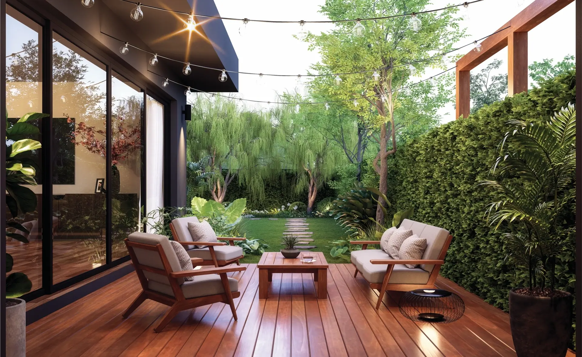
Start by considering the primary function of each room. For example, calming tones like blues and greens are ideal for bedrooms, promoting relaxation and restful sleep. In contrast, vibrant hues such as yellows and oranges work well in areas meant for socializing, like the living room, fostering energy and warmth.
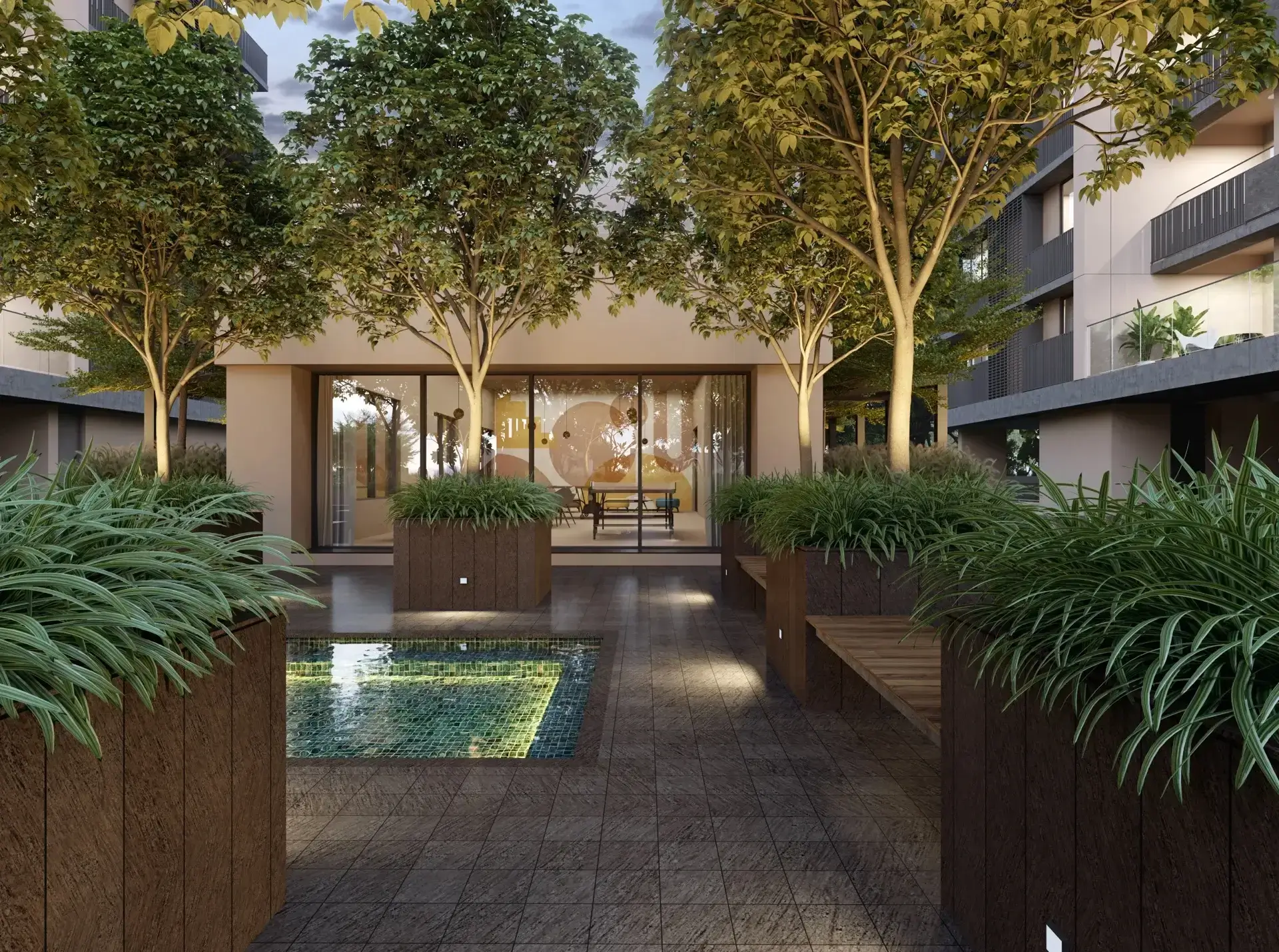
Neutral colors like beige, grey, and white serve as versatile foundations, allowing you to experiment with accent colors. They create a timeless backdrop and offer flexibility for changing styles or preferences over time.
Warm colors like reds and yellows can add coziness and intimacy to a space, making them suitable for dining rooms or areas where you want to encourage conversation. However, it's essential to balance warm tones with cooler ones to prevent the space from feeling too intense.
Cool colors, such as blues and greens, evoke a sense of calmness and tranquillity. These are excellent choices for spaces where relaxation is a priority, like bathrooms or reading nooks. Various shades within the cool color spectrum can add depth and interest to the design.
Consider the size and lighting of each room. Lighter colors can make a small room feel more spacious, while darker hues create a more intimate atmosphere in larger spaces. Pay attention to natural light, as it can influence how colors appear throughout the day.
Texture plays a role in color perception as well. Matte finishes absorb more light, giving colors a softer appearance, while glossy finishes reflect light, making colors more vibrant. Experimenting with textures can enhance the overall visual appeal of your chosen color palette.
Harmony is key when combining colors. Analogous color schemes involve selecting colors that are adjacent on the color wheel, creating a cohesive and serene look. Complementary color schemes involve pairing colors from opposite sides of the wheel, providing high contrast and vibrancy.
Don't overlook the psychological impact of neutrals. White signifies purity and cleanliness, making it a popular choice for bathrooms and kitchens. Beige is associated with warmth and stability, making it a versatile option for various rooms.
Bold accent colors can be introduced through accessories, artwork, or furniture. This allows you to inject personality into your space without committing to an entire room painted in a bold hue. Consider the emotional response you want to evoke when choosing these accents.
Ultimately, personal preferences should guide your color choices. Your home reflects your style and personality, so choose colors that resonate with you. Sample paint colors in small sections of the wall to see how they interact with the room's lighting before committing to a full application.
Hence, color psychology is a powerful tool in interior design. By understanding the emotional and visual impact of different colors, you can create a home that not only looks appealing but also supports the desired atmosphere for each room.
– Hardi Shah